A computer screen displaying a research website called Info-Tech, featuring research articles and projects related to AI, IT product practices, and cloud management, with a blue background.

Thought Models – High Value Infographics

Stakeholder Interviews and Infographic Design

My role as a UX Designer was to:

  1. Understand complex IT research and it’s use case through an interview with an IT research team.

  2. Display the research in a way that is easily digestible for the IT layperson and complex+interesting enough to intrigue IT leaders of global corporations.

  3. Collaborate with a visual designer to give the black and white content some life through design.

Time Frame
2022 - 2024

Project Status
Over 18+ months, I did 50+ Interviews to create these Infographics (Most within the UX Team) with 20+ different research stakeholders, collaborating with 15 different designers along the way, helping the company deliver and sell research worth $$$ millions.

Team
Me, 20+ Research Stakeholders (Carlene Mccubbin, Ari Glaziel, et al.), 15+ Designers (Val Poon, Diana Tzinis et al.)

What is a Thought Model?

Info-Tech produces Thought Model Infographics that summarize complex IT research and display it onto a one page infographic. Each Thought Model tells a unique IT story, ranging from the various domains within IT (from Information Security to Artifical Intelligence).

The Process

Each Thought Model passes through a series of rounds with various people before being published/used for the various purposes. Each Thought Model involves:

  1. IT Research team: Has a need to represent a complex research topic through an infographic.

  2. UX Designer (My role): Understand the research and it’s use case, represent it through a black and white diagram, and collaborate with a visual designer.

  3. Visual Designer: Bring the research to life through design; generating visual interest without sacrificing meaning.

The Goal

These infographics are used as an:

  • “Entryway” to the research like shown on any research page on Info-Tech, for example, here.

  • As marketing collateral, used on channels like LinkedIn, as shown here.

  • For presentations and discussions in webinars, roundtables, and IT consultant engagements, as used in the video here. (Jump to 39:35 in the video to see Travis use the Thought Model to present his research topic.)

Each Thought Model went through a series of steps:

Interview/working diagrams

Researcher’s diagrams dissected during interviews and group discussions.

A slide presentation with multiple thumbnail slides, mostly in grayscale with some blue highlights, and a star icon on the right side of the last slide.

UX Wireframes

All of these wireframes are done by me. (Click to zoom on any wireframe.)

Finalized Visual Design

All of these are done by various visual designers. (Click to zoom on any design.)

A presentation slide with a flowchart illustrating the process of setting goals, inputs, and performance measurement related to mission, vision, values, organizational goals, department goals, team goals, and individual goals, including feedback and evaluation steps.
A layered diagram illustrating the flow and relationship of different types of agricultural data and infrastructure, including soil, underground biomass, irrigation, crop fields, and platform tools, with arrows indicating data flow between layers.
Diagram showing a blue and purple business process automation graph with various labeled steps and annotations, overlaid on a larger document about developing a value-first business automation strategy. The diagram includes boxes, arrows, and text labels for different stages like perception, exploration, and optimization.
Flowchart depicting product management and development process, stages from vision and feedback to release and value realization, including backlog, sprint, and review phases, with annotations on process optimization and Agile methodology.
A digital infographic titled 'Thought Model - Draft' illustrating a flowchart about digital identity, its ecosystem, principles, adoption factors, and risks management with various diagrams and charts.
A presentation slide with diagrams and text explaining developing a flexible IT funding model. The slide includes two circular diagrams titled 'What does funding model constitute and what would make funding models flexible?' and text detailing the dimensions of the right IT funding model, including assessments, best-fit evaluation, communication, and demonstrations. The layout comprises a diagram with various labels, arrows, and text boxes on a white background.
A detailed infographic about managing security and privacy risks for generative AI, including risk categories, attack types, data confidentiality issues, and safety measures, with color-coded sections and conic circle diagrams.
A presentation slide titled 'Develop and Implement a Security Incident Management program' with a focus on creating scalable incident response programs without breaking the bank. It includes sections on problem statement, challenges of inadequate security incident management, six stages of incident management lifecycle, benefits, and a workflow diagram showing five steps: detect, leverage, contain, eliminate, recover, and post-incident activities, with supporting annotations and descriptions.
Diagram titled 'Artificial Intelligence: Privacy Impact Assessment Model' illustrating the components of a privacy impact assessment process, including sections for problem identification, solution scope, methodology, and reporting, with a flowchart at the bottom detailing steps from understanding to analyzing AI systems.
Diagram titled 'Balanced Value Score' showing a framework for measuring enterprise goals and the impact of product backlog item, including calculation of a balanced business value score, decision wheel, and a roadmap visual with stages labeled 'QUICK WIN,' 'QUALIFIED,' and 'READY.' includes text describing the process and criteria for prioritization.
Diagram illustrating AI transformation in product development, showing stages of market leaders, product strategy, and operational optimization, with statistics and highlights on growth opportunities and disruption.
A detailed infographic explaining donor management systems, outlining three pillars: Donor Nurturing, Donor Management, and Digital Transformation. It includes sections on security, data analytics, engagement, stewardship, and the three steps for evaluating and building an effective system.
A chart comparing leadership and business skills and qualities, with categories like influence, trust, team development, strategic execution, and critical thinking, divided into sections for leadership, personal growth, and business development.
Flowchart titled 'Standardize the Service Desk' illustrating the process from first contact to ticket closure, including challenges faced by end users and service desk technicians, potential solutions, and expected outcomes for improved service desk efficiency.
A detailed business infographic outlining strategies for building exponential IT products, including sections on product practices, portfolio, business vision, core competencies, and a note to designers.
A strategic diagram showing practices for cloud cost management, including steps like cloud reporting, showback implementation, and metrics establishment, with activities such as tagging, billing, and metrics setting, organized under categories of activity outcomes and activities.
A detailed strategy map for IT talent management showing pillars such as Culture, Organizational Structure & Roles, Recruitment, and Learning & Development, with associated goals, core measures, key initiatives, and a picture of a roadmap for continuous improvement.
Data Quality Thought Model diagram with annotations. The model includes sections on problem space, understanding, discovery, key components, governance, technology, and process. Annotations in red text highlight issues like poor data quality, the importance of addressing issues at scale, the role of technology, and the need for sustainable solutions.
Infographic about establishing integrated and dynamic risk management, detailing problem, milestones, approach, and results with color-coded sections and bullet points.

*I also did the design for this one!

A detailed infographic titled "Establish a Vendor Management Roadmap to succeed with Autonomous Technologies." It outlines a three-phase process for vendor management with key milestones, activities, and results. The phases are: 1) Identify the VMI Future, 2) Select Autonomous VMI Initiatives, 3) Develop the Roadmap. The infographic features a cycle diagram at the center showing the vendor management process: Plan, Build, Run, and Review. It includes sections with milestones, actions, and goals such as integration, dashboards, strategic skills, vendor relationships, and data insights, with color-coded boxes and pink star icons for key points.
A cybersecurity roadmap graphic comparing manual, automated, AI-assisted, and autonomous security measures. The image includes various text sections discussing AI opportunities, risks, and building a security delivery plan.
View All my 50+ on Figma

Having worked through a total of over 50 Thought Models at my time at Info-Tech, there were a number of things I learned about the various domanins of IT that I did not know before. Since each of the 20+ researchers were different, it gave me an opportunity to hone in on my interviewing skills. It also helped me get really good at articulating my design decisions to various teams. I often used techniques learned through a book (Articulating Design Decisions by Tom Greever) that I also encourage my class to read at George Brown College.

Fixing an internal process to help the company save $ and time.

Infographic explaining how assembling the right tools, technical skills, and data can help leverage AI in test automation strategy, with benefits such as improved coverage, efficiency, faster design, and cost reduction.
A digital infographic titled 'Leverage Gen AI to Improve Your Test Automation Strategy' shows steps from determining readiness to testing strategy, and lists benefits of testing automation, with sections on knowledge, tools, data, and drivers at the bottom, against a backdrop of a futuristic cityscape.

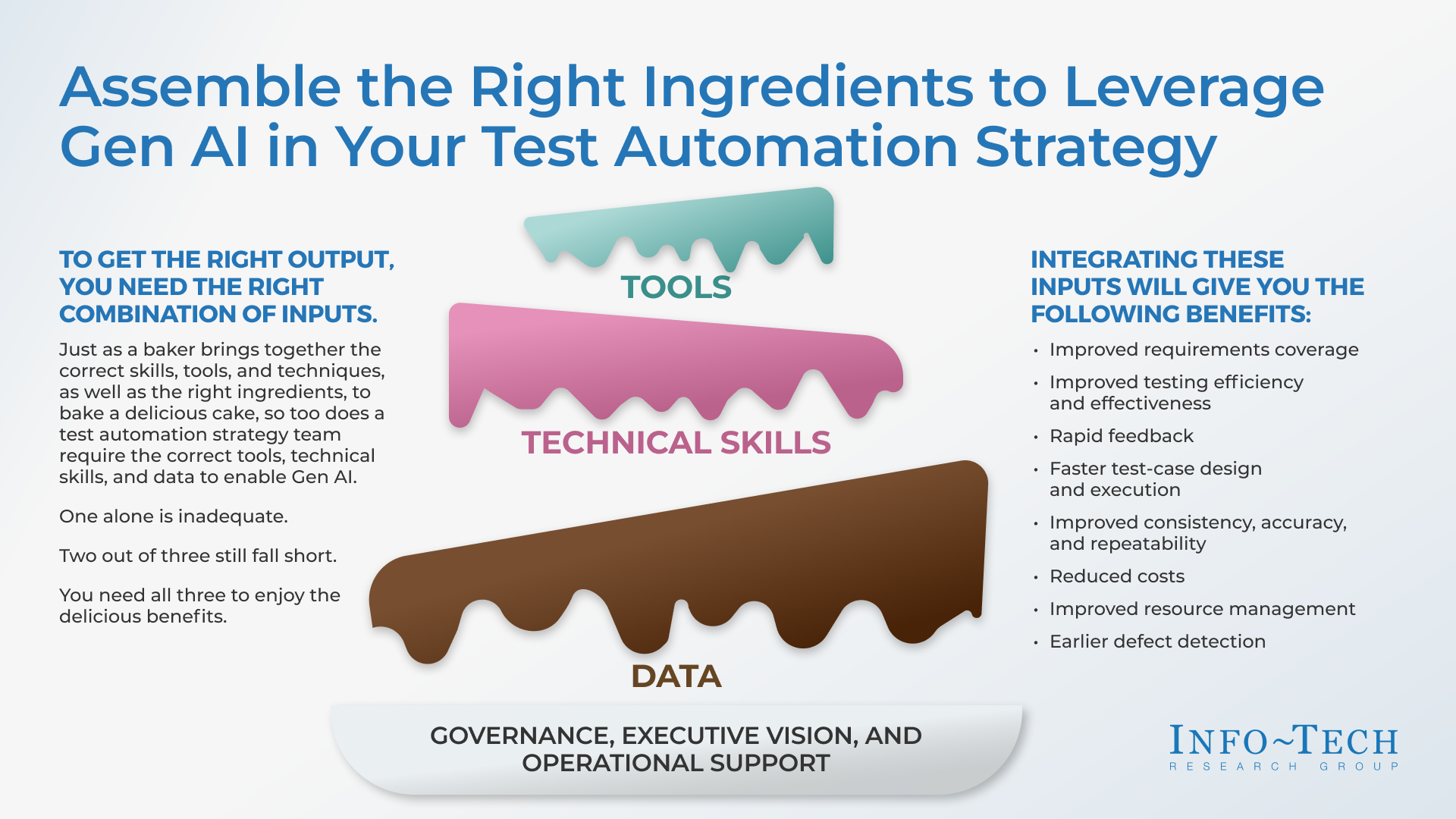
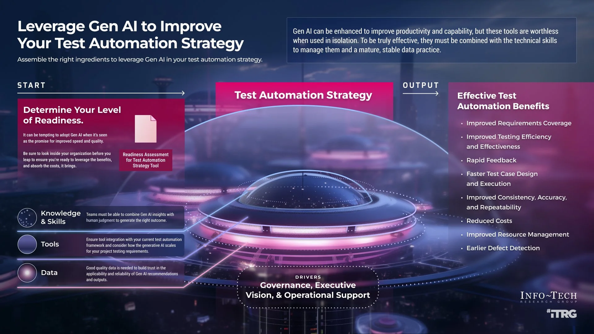
Both of these graphics belong to the same research. Because they were turned in by 2 different teams at 2 different times, they were picked up as 2 separate tasks by 2 different desigers, resulting in 2 very different looking graphics.

Because I was in “office hours” (a time we collected as a team and used for feedback), I recognized (through the cake analogy) that I had already been a part of an interview for this research. This is what helped me instigate a design ops/UX Research project!

What we did:

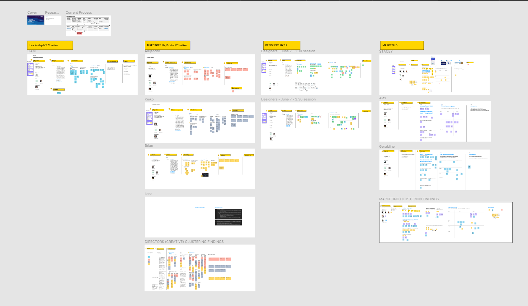
During my time, I instigated a side project when I saw an inconsistency with some deliverables. I collaborated with Daniela Flores to find and fix some parts of the Thought Model creation process. Through a series of interviews with various stakeholders, we learned that:

  • The teams were not always aligned on the goals, causing friction in deliverables.

  • The visual designers sometimes lacked context when the wireframe was passed to them, causing re-work to understand the concept, and having to re-involve stakeholders.

  • The marketing team were requesting simpler versions of the graphics at different stages of the project lifecycle to be used on social media. Being on a huge team with various moving projects, this meant that most times, a different visual designer would pick up the task. This caused a longer timeline for delivery because the new designer would often re-think the research topic resulting in lost time. This also led to discrepancies in the visuals of the deliverables as sometimes, the new designer would have no visibility into the last project.

A collage of presentation slides with various flowcharts, diagrams, and schedules, organized under themes like leadership, directors, designers, marketing, and clustering findings, with some slides containing highlighted text and colorful sticky notes.

What that resulted in:

Because of the insights we learned from this project, there were two major changes made to the Thought Model and supporting graphics creation process:

  • Visual designers are now involved in the intakes (where the researcher explains the concept). This benefits them by allowing them to:

    • learn more about the research, making it easier to take the wireframes forward at a later stage.

    • ask questions about the visual design direction/intent early on.

  • Since these graphics need to be converted to other collaterals for marketing/social media, they are now designed by the same visual designer. This ensures that:

    • the team saves time and company dollars.

    • graphics do not look completely different from each other.

Interested in seeing more work?

Back to Info-Tech Projects
Back to all projects